Many systems that do discourse mapping, argument mapping, issue tracking, etc., use a graph in the user interface. Though graphs are capable of gracefully visualizing the structure of the content, I propose that they come with serious tradeoffs in terms of user experience, both in terms of visual “clutter” and mobile-friendliness. I posit a rough continuum of designs characterized by the degree of integration between the text (which ultimately carries meaning at the most detailed level) and visualized graphs (which seek to augment or summarize that meaning). On one end are designs with maximal integration, e.g., those those embed text inside nodes in a graph. On the other end are designs that are entirely text-based. I conclude that the ideal system would probably be a form of hybrid that makes use of the unique strengths of each.
High integration: nodes with text inside
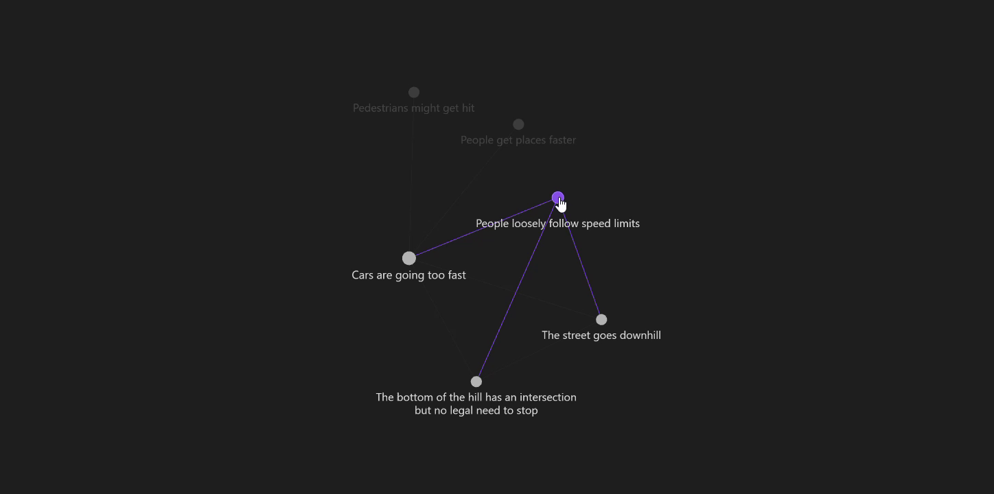
This screenshot from Ameliorate demonstrates this approach.
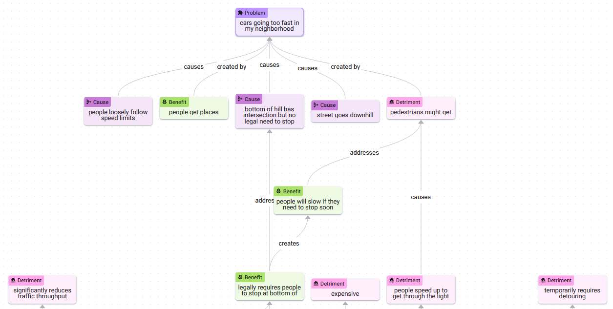
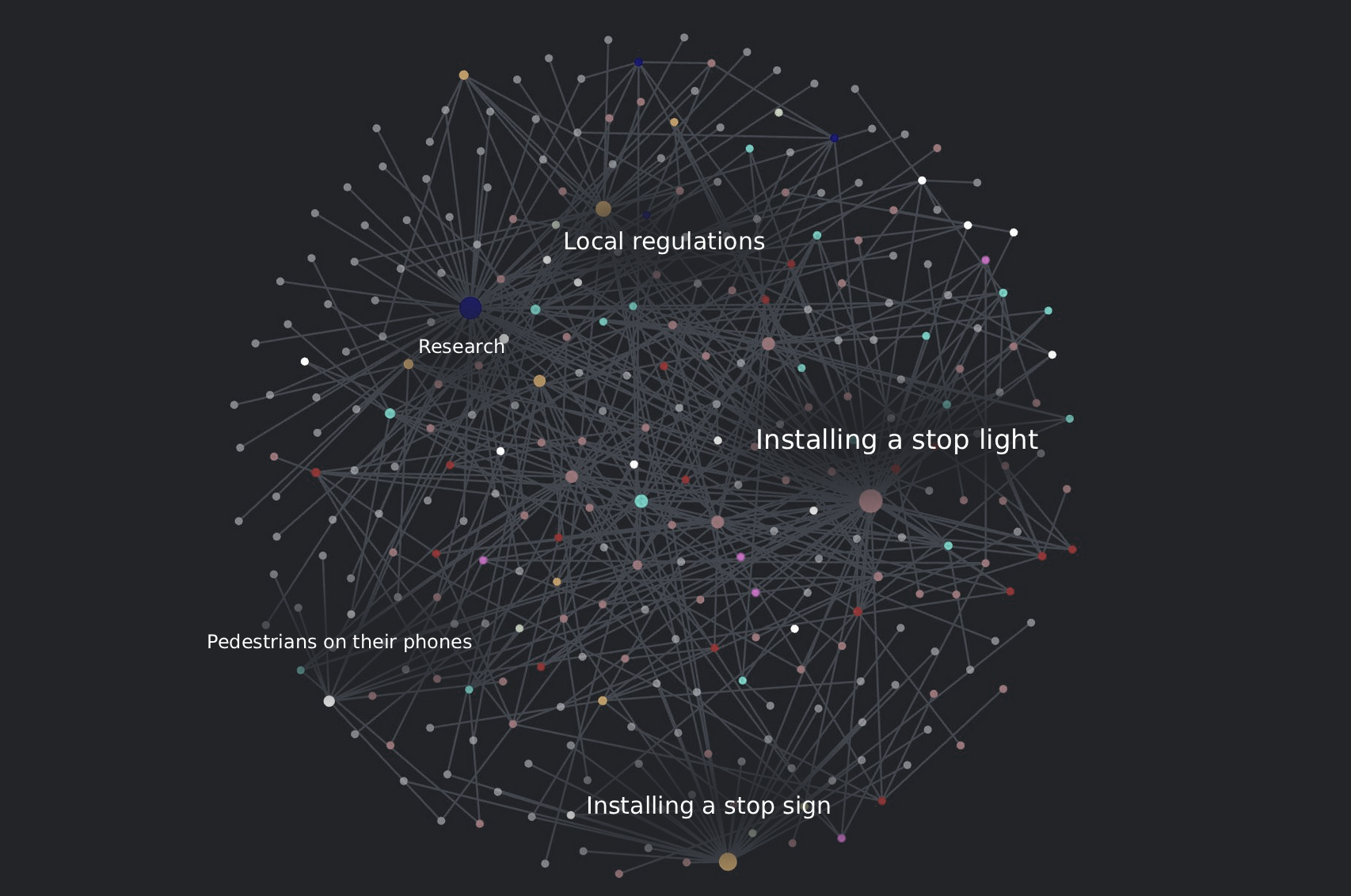
Though you can read through the structure of the situation (cars are going too fast, there are several causes, there’s a reason why this is a problem, there’s a reason why it might not be a problem, etc.), you can also glimpse a design challenge that these systems inevitably face: complex graphs are hard to read. That is, the semantic value of visualizing graphs diminishes beyond a certain number of nodes, at least when you are combining them with embedded text like this. It is possible to devise methods to limit the number of nodes that are visible at one time, e.g., creating a “focal region” — a flashlight that scans over the complex graph, revealing only small regions at a time.
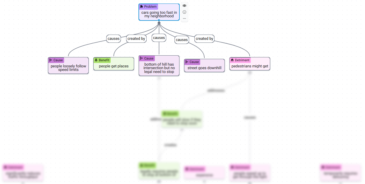
This is much easier to read. But if this subgraph is all you want to see at a given moment, how much is the structure of the graph visualization contributing? Much of the screen space is consumed by nodes outside the focused region. Given the simplified nature of this view, perhaps those structural characteristics which the graph communicates could be conveyed instead by the structural features that come a text-native interface, e.g., headings, lists, etc.
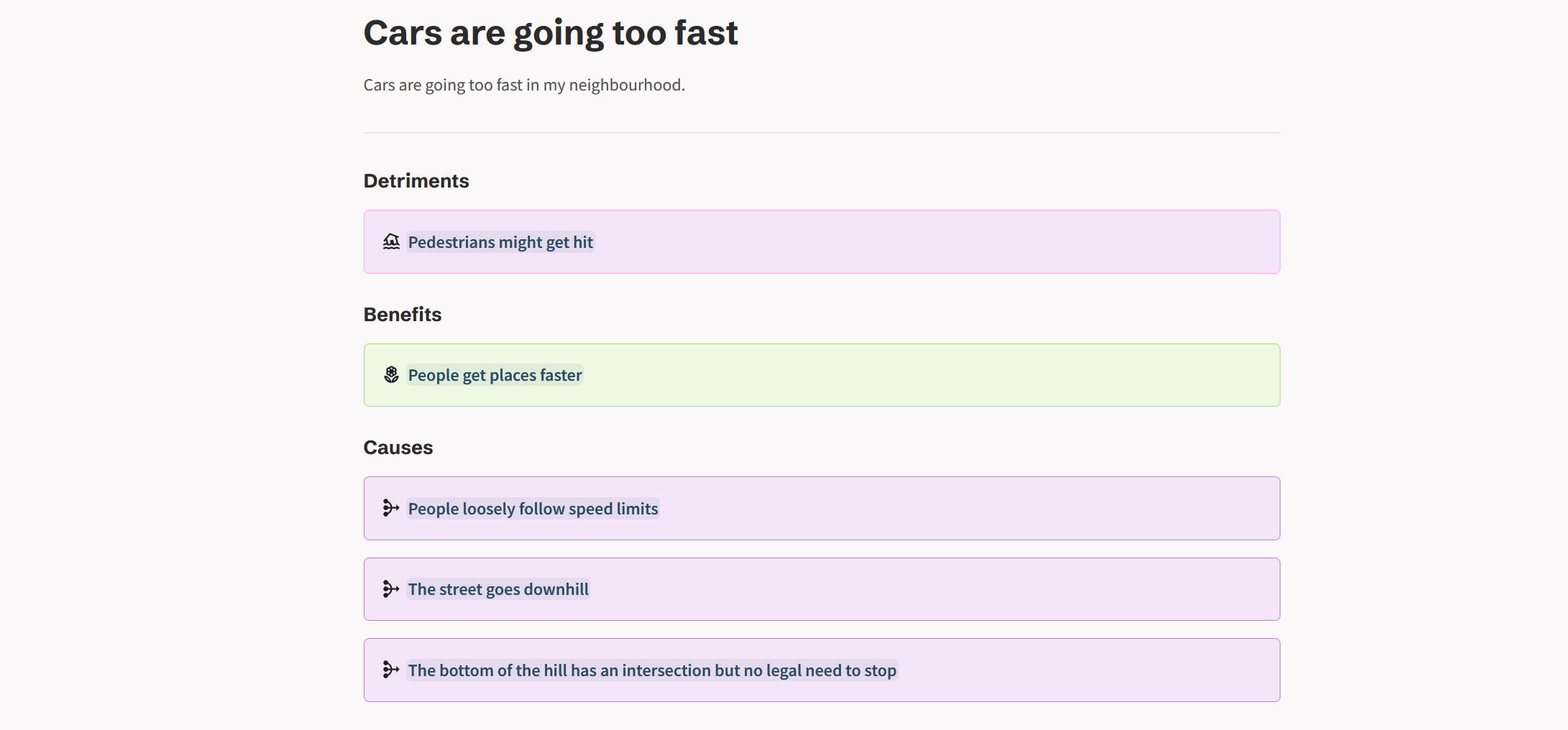
Low integration: fully text-based
On the opposite end of the continuum are text-only designs. These attempt to communicate the structural aspects of a model using the tools of a text-native interface.
On the limitations of text
In some ways, plain text is exactly the medium which graph-based mapping systems were designed to escape; the fundamental problem with text being that it’s too unrestrictive — it permits fluff, verbosity, and rhetorical devices that can obscure and mislead. But I will argue that a well-designed text-based mapping system would find itself in a similar position with respect to these issues as a graph-based one. Here’s the main reason.
You could imagine every interactive UI element of a graph-based system being transposed into a text-based system. For example, if you start from the “cars going too fast” node (page), you could click to create a detriment; click to create a benefit. Following those through to their respective pages, you could continue building out the “graph” in much the same fashion. What once were node types become categorized under headings. You can still use colors and icons to convey meaning. Though it’s possible to enter paragraph-length text into individual nodes in a graph view, this is discouraged by the size of the text box in that interface — a feature which you could recreate in a text-native setting, also by limiting the text box size. If verbosity is a concern, you could impose character limits.
Managing verbosity in text vs. graph-based systems
A large part of what makes mapping systems like these effective is that they force users to break down their thoughts into discrete chunks and make the relationships between them explicit. The fact that graph-based interfaces do a better job of suggesting this workflow to users is a result of graphical design features that can be replicated in a text-only setting. The problem of verbosity has deeper roots. Giving a user a text box is a dangerous thing, regardless of how big it is or the graphic design that surrounds it. Users can, and should, be able to enter whatever text they want. The power of interface design to suggest certain types of input can only take you so far.
In my opinion, in order for a mapping system to be highly effective, it will need to use LLMs as a “friendly” barrier layer between users and the map to help “nudge” inputs in directions that are more amenable to effective mapping. Furthermore, since less-than-rational inputs will inevitably make it into the map, LLMs will also need to be used to organize the map itself along axes such as level-of-detail, level-of-clarity, likeliness-to-be-relevant, etc., in order to make the map reducible into views that are useful to users.
Approaches for a hybrid system
Both text and graphs have unique strengths. Perhaps an ideal system would find a way to combine them.
Separating text from nodes in the same view
Sense Atlas extracts text from the nodes and places it in a more traditional text panel on the left of the screen. This helps reduce clutter in the graph view which plays to its strength of visualizing overall structure. It also improves the reading experience by showing only the text of the nodes you’re focused on and presenting it in a more traditional layout.
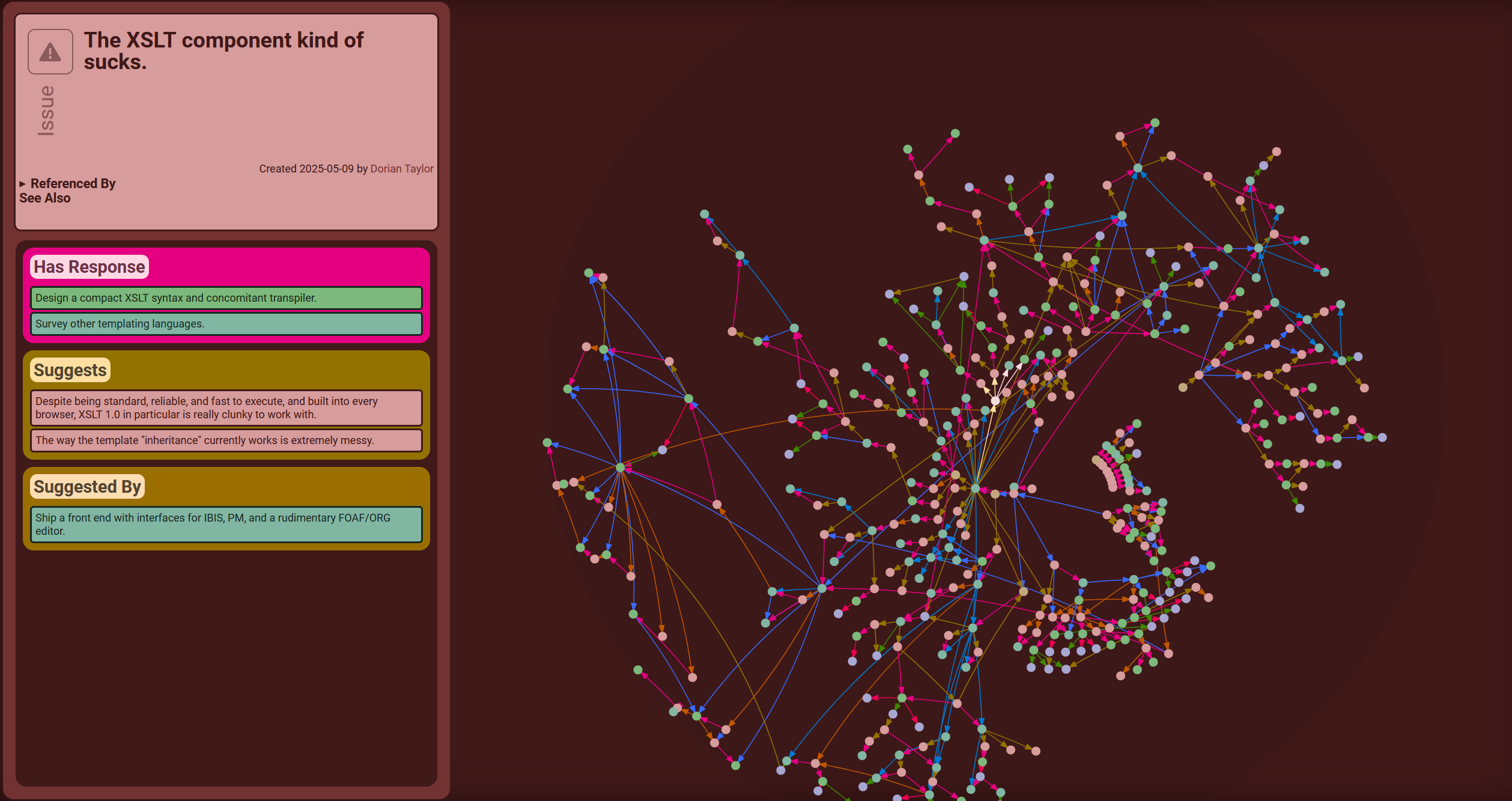
But this hybrid view is, in some ways, the worst of both worlds. Though the structure of the graph is better represented, much of its useful meaning is lost without any inline text at all. At the same time, the text itself is relegated to a side panel where the reading experience suffers.
Text and nodes in completely different views
Obsidian breaks graph and text interfaces into entirely separate views which gives each the freedom to highly optimize for their particular kind of user experience. Then, it bridges the divide between these two views by making each accessible from the other at a single click.
 It improves on Sense Atlas’s graph view by adding slightly more meaning via the inclusion of some text, i.e., node titles.
Multi-resolution text-on-graph
To build on this “text-on-graph” view further, you could label regions of the graph that are characterized by certain subtopics or sub-conversations.
Then, when you zoom in, the region labels could start to disappear, individual node labels could start to appear, and perhaps text could even starts to appear inside the nodes of highest significance. This approach would be highly analogous to the way that street mapping programs handle labels and zooming.
Optimizing text with graph-on-text views
To bring some of the unique communicative value of graphs into the text-based experience, you could imagine a text-based view with a small window that displays a rendering of the region of the graph that is local to the current page.